The Green Chair Group produces a proprietary, copyright-pending tool, the GreenSheet. The GreenSheet consists of over 40 interactive pages that use advanced analytics to enhance standard market tools by drilling deeper into data to identify bottlenecks and inefficiencies, particularly in MRI workflows.
By leveraging insights from existing enterprise tools (e.g., Bialogics), the GreenSheet identifies specific areas for process improvements with targeted analytics focused on clinical, operational, logistical, and financial workflows.
The Green Chair Group interprets the detailed data with a comprehensive analysis to provide targeted solutions to obstacles, which, when applied, lead to measurable improvements. Results include enabling streamlined scheduling, aligned EMR systems (e.g., EPIC), improved patient and staff coordination, and optimized operations to enhance clinical workflow productivity.
What the GreenSheet offers
The GreenSheet provides curated data collected from specific healthcare institutions. Reports range in size depending on what parameters clients opt for analysis. Each page visually interprets the data in a customized user-selected format.
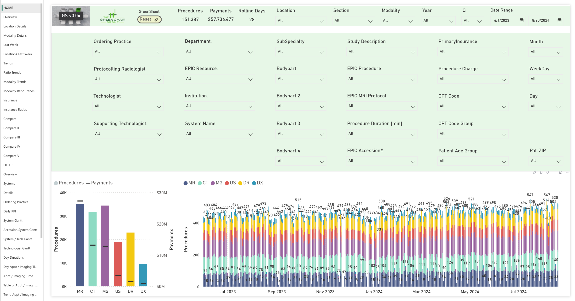
GreenSheet Home
When users receive the initial page, as depicted in this figure, they see a comprehensive image of analyses conducted by The Green Chair Group.
Each parameter has a pull-down menu, offering a powerful tool for in-depth analysis for any combination of data sets impacting their operations. Data can be analyzed by referral practice, technologist, scanner, body part, clinical protocol, and case data across various locations and payor mixes, providing granular exploration and identifying potential workflow bottlenecks and inefficiencies.
Users can identify optimization and process improvement opportunities by enabling detailed data segmentation.
By leveraging the GreenSheet’s data-driven insights, users can make targeted, impactful adjustments to boost performance where needed, aligning overall institutional goals with optimized, resource-efficient operations.
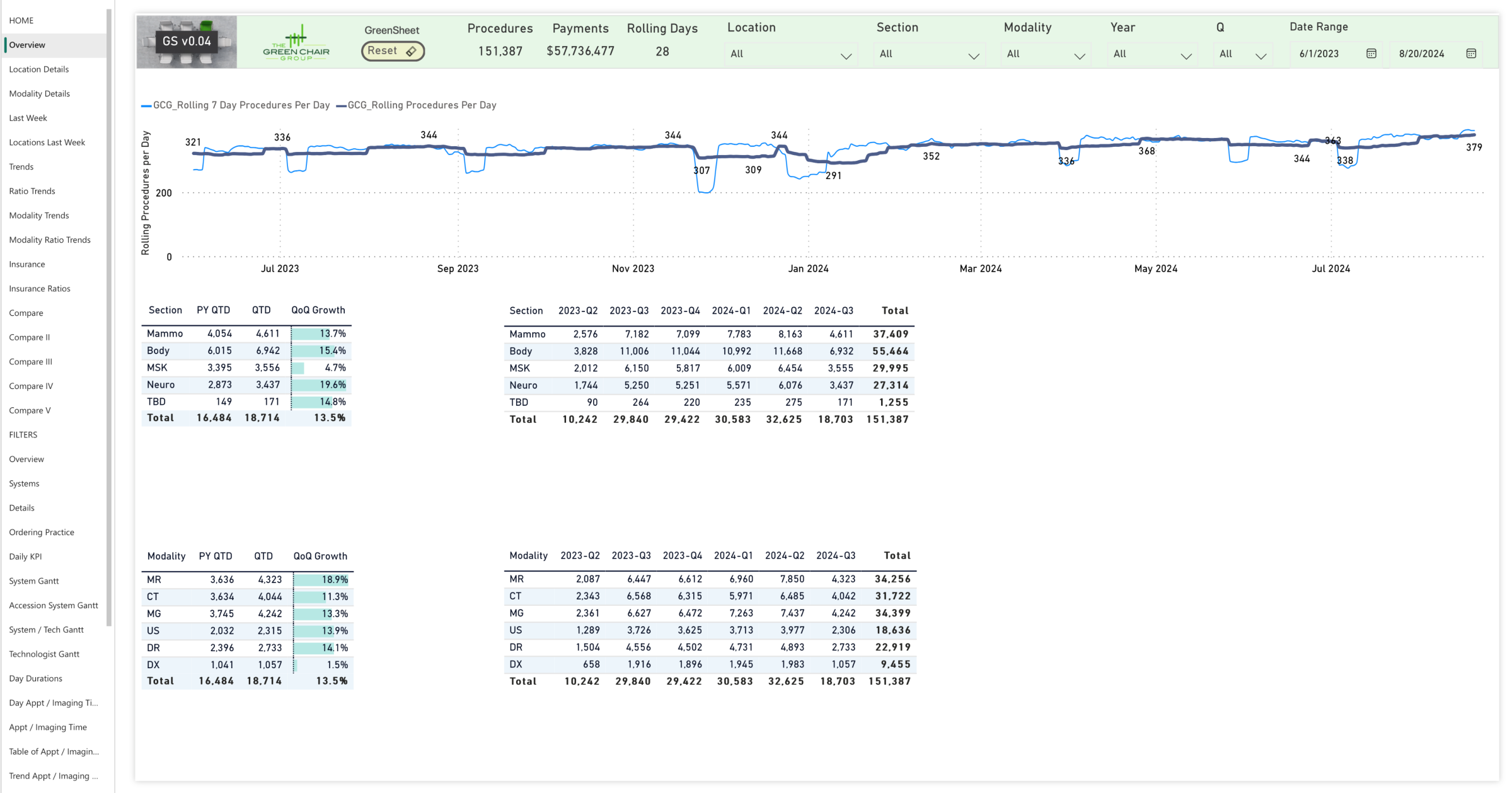
Overview
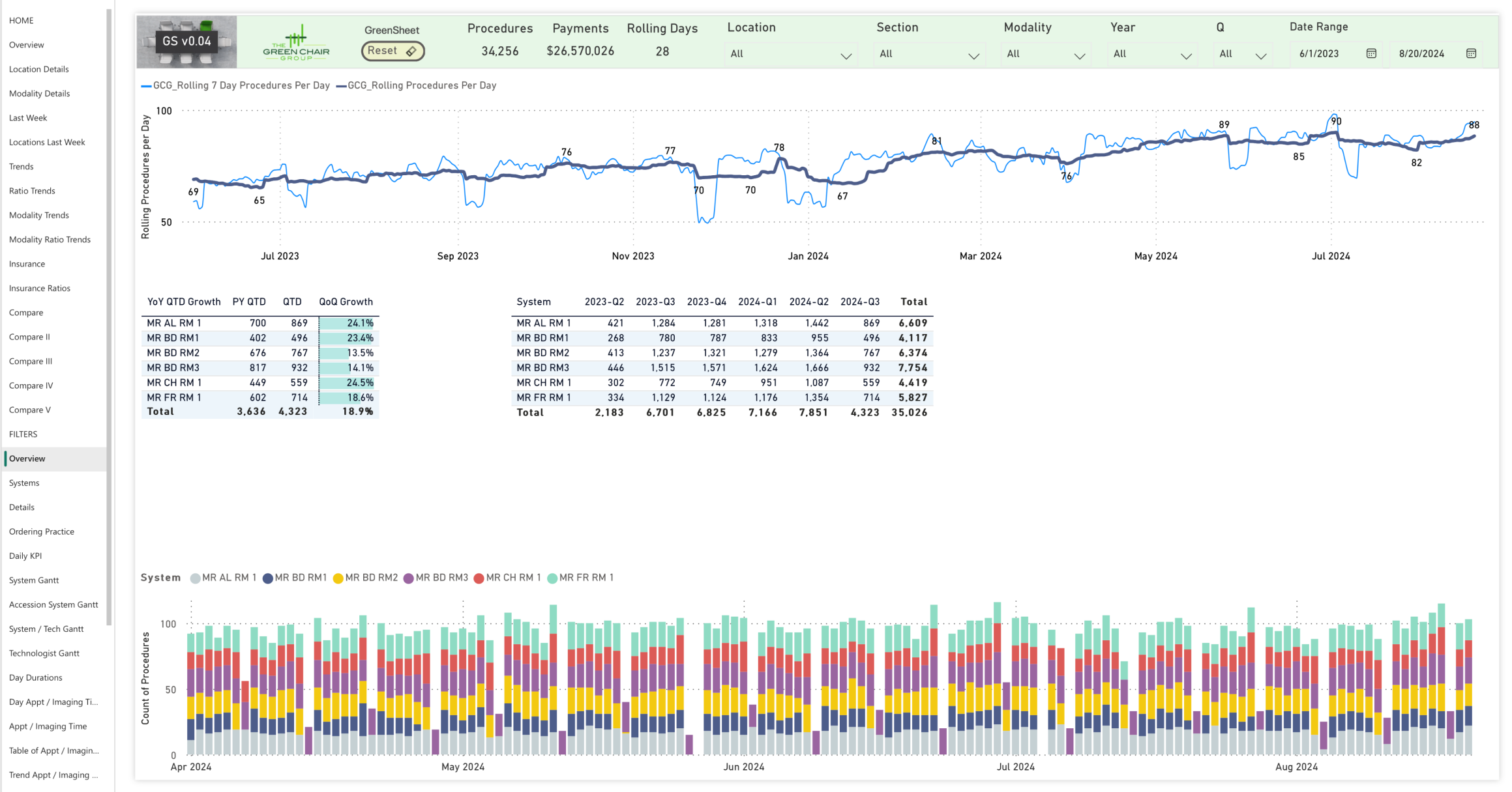
In this Overiew Page, users observe how the GreenSheet and The Green Chair Group’s expertise in post-analysis and guided implementation of solutions can sustainably increase patient throughput by over 20%. Operational granularity is shown for any chosen parameter combination.
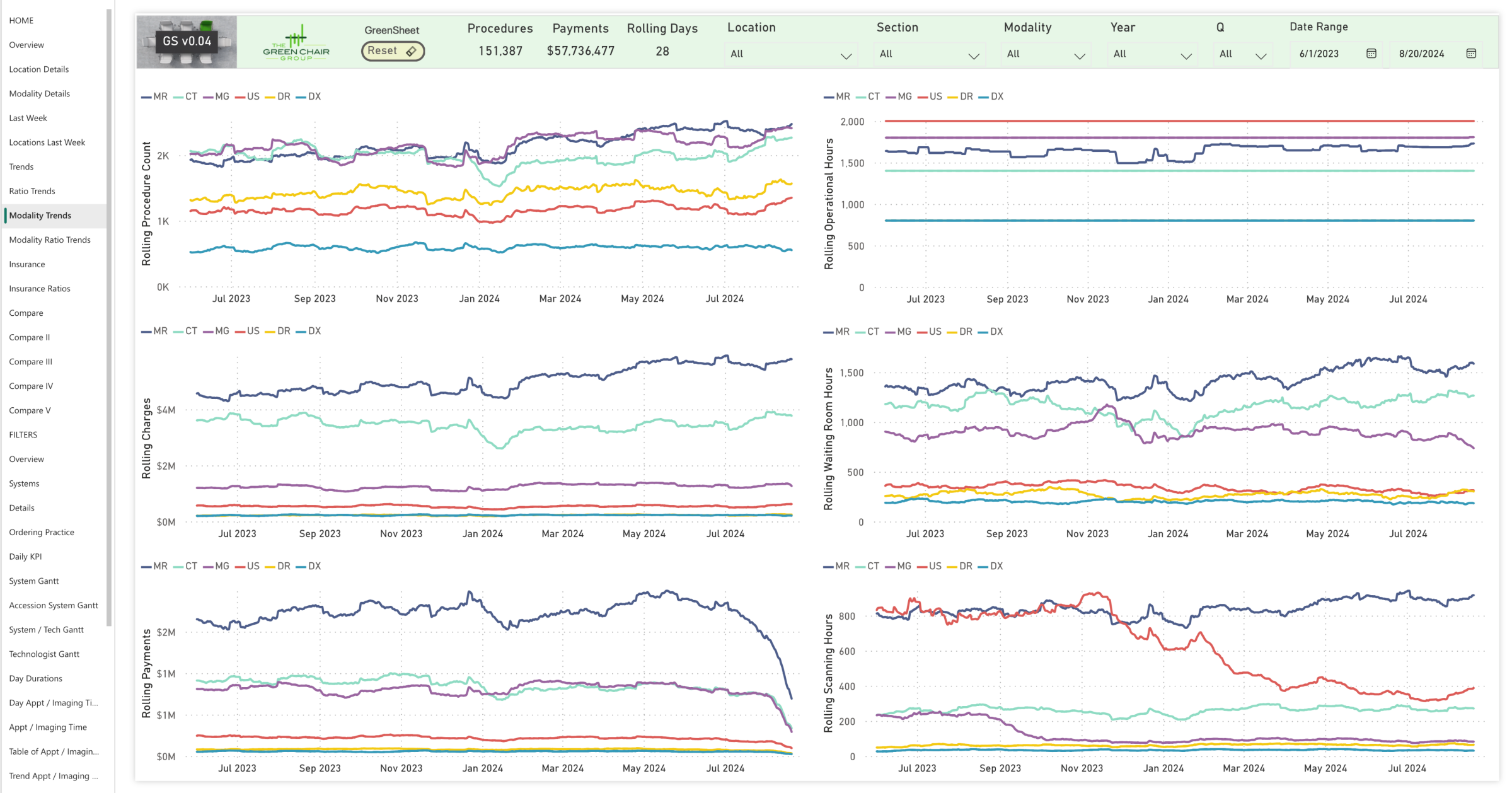
Modality Trends
This figure shows a deep dive into operational details, from a broad overview to granular specifics, enabling comparisons between different locations and modalities.
Healthcare institutions can significantly improve patient throughput, reduce wait times, and enhance patient satisfaction by streamlining workflows and optimizing operations. Users can experience an efficient and effective healthcare delivery system, benefiting patients and staff.
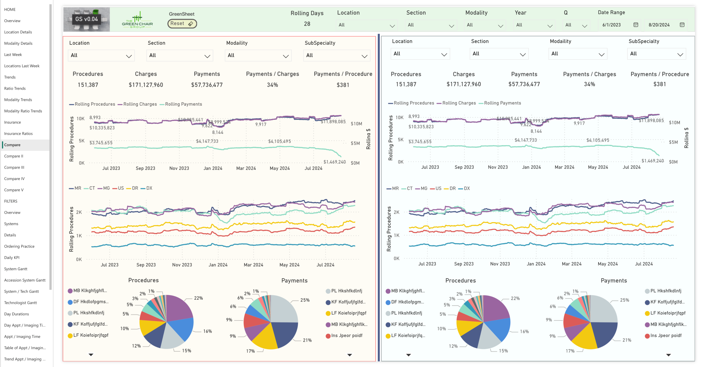
Comparisons
This figure is the first of four pages comparing two sets of data. The GreenSheet enables comparisons across clinical sections, subspecialties, institutional locations, and more, empowering informed decisions on service adjustments and expansion areas to maximize clinical, operational, logistical, and financial performance.
The shown page compares two locations of the same Healthcare system with diverse payor mixes. The Comparison pages reveale strategic growth opportunities and highlight areas for expansion by zip code, imaging modality, or procedure type.
Parameter Selection
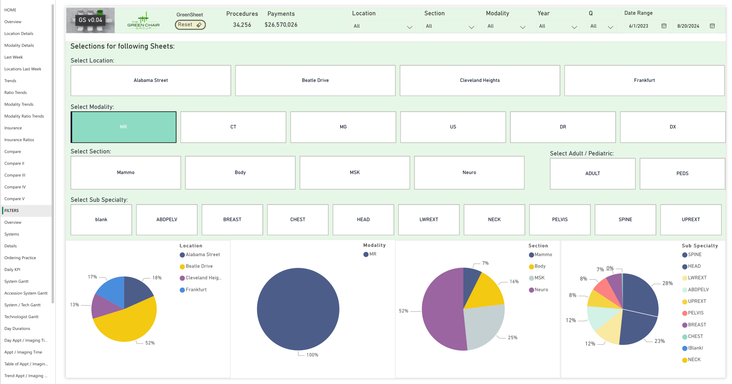
The GreenSheet has a user-friendly interface that allows the selection of critical parameters, pinpointing operational bottlenecks for targeted improvements.
The customizable interface allows users to select any combination of specific focus areas (MRI was selected for this example) to drill deeply into targeted data insights. Flexibility allows users to go beyond identifying overspending to pinpoint the root cause of inefficiencies or delays in operational performance across departments, locations, or processes. The Green Chair Group then assesses the findings to propose concrete operational improvements.
By leveraging the GreenSheet, users can home in on financial expenditure or operational time management inefficiencies, enabling a comprehensive approach to performance enhancement. This tailored capability helps to maximize efficiency, improve service delivery, and ensure resource allocation aligns with institutional goals.
Deeper Level Overview
The deeper level overview highlights current throughput levels and identifies areas for potential adjustments and improvements. It enables both daily and long-term progress tracking to ensure sustainable enhancements. After an initial high-level overview of clinical productivity (e.g., MRI), costs, and time efficiency, the figure zeroes in on the operational metrics of individual scanners, helping to identify specific areas for improvement in equipment usage and service effectiveness.
With the overall performance snapshot for operations, users receive a focused analysis specific to the selected parameters, with a detailed look at individual scanner performance.
Ordering Practice or Physician
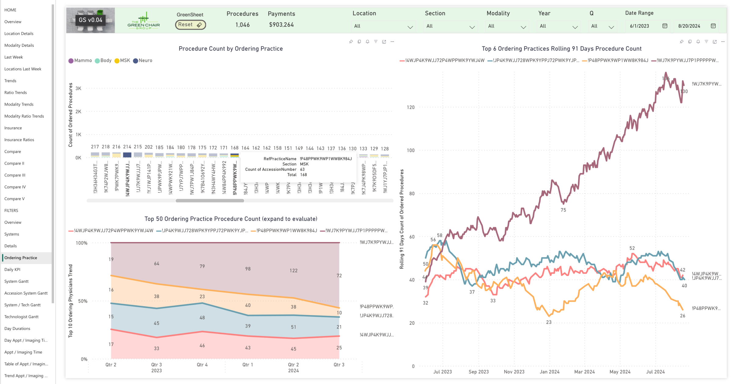
This figure illustrates the foundational role of patient referrals, providing insights into which practices and specific physicians are referring patients.
Monitoring the volume of patients referred over time is crucial, especially as practices grow and increase their patient base. If referrals from a significant source, like the practice referenced in the “orange” line in the figure, begin to decline, it’s essential to investigate the root cause.
Understanding why these referrals are decreasing helps identify gaps—what other practices may be doing better—and offers opportunities to enhance appeal to these patients. Similarly, users can build upon their relationship with referring partners, like the one referenced by the “dark red” line in the figure. The goal is to boost referral traffic so that referring partners maintain a robust demand pipeline.
Daily Operational Detail
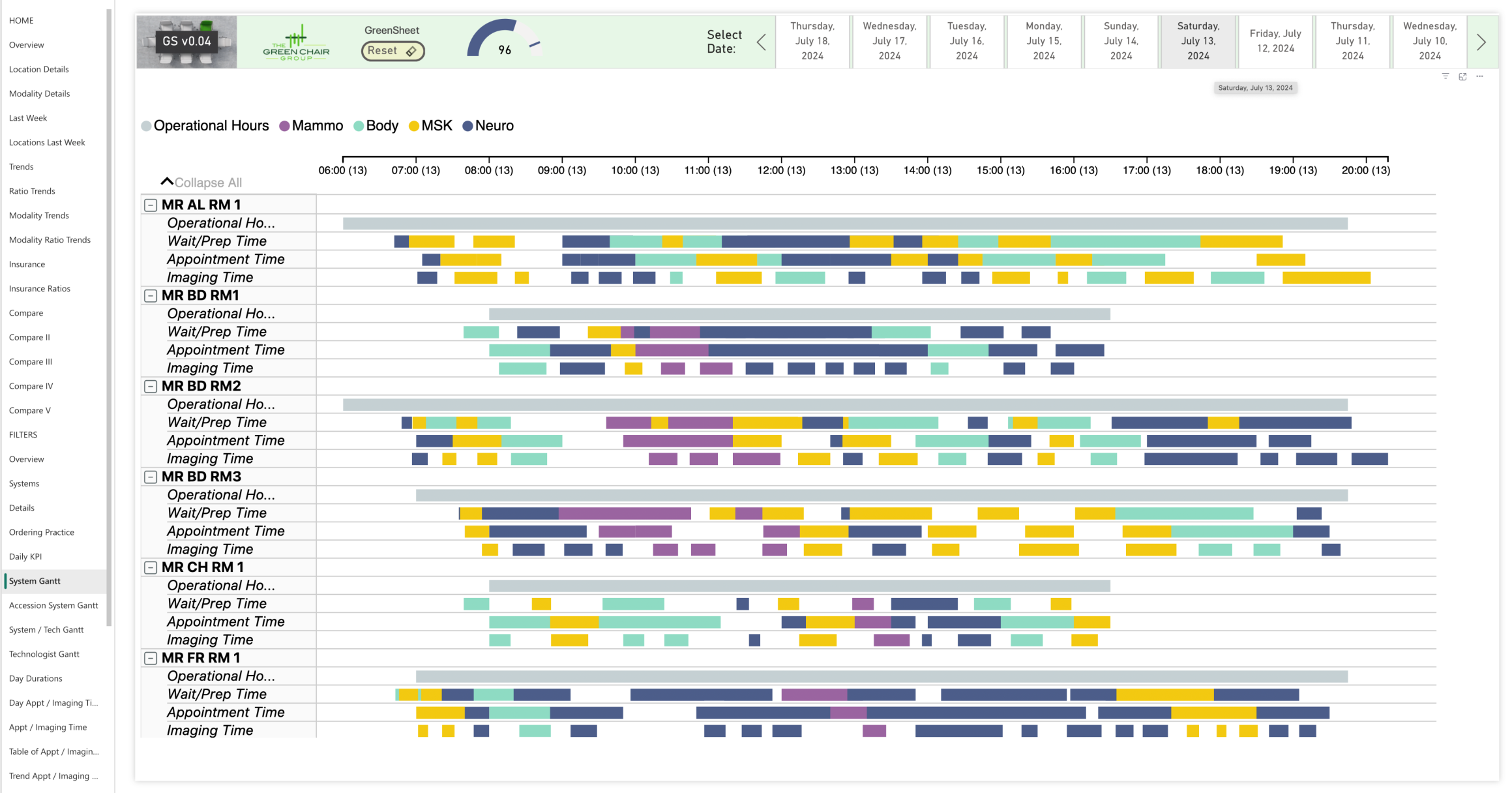
The GreenSheet provides an in-depth analysis of all scanning-related aspects across every scanner and operational hour for a healthcare institution. The GreenSheet evaluates operational hours, patient scheduling, wait and prep times, and scan durations to identify and address inefficiencies and bottlenecks.
The objective is to align appointment times closely with imaging times, avoiding delays and over- or under-scheduling. Comparing patient wait times to scheduled appointment times with the actual time spent on imaging ensures that operational hours are used efficiently.
Modern scanning techniques are a great addition to every fleet. But “just” scanning faster is not enough. All operational aspects must be examined and optimized to yield benefits and increase patient volume sustainably while maintaining clinical care at the highest level.
Institutions benefit from clinical, logistical, and financial performance when all operational aspects are optimized after obstacles and misalignments are identified.
In Depth Analysis You Can Act On
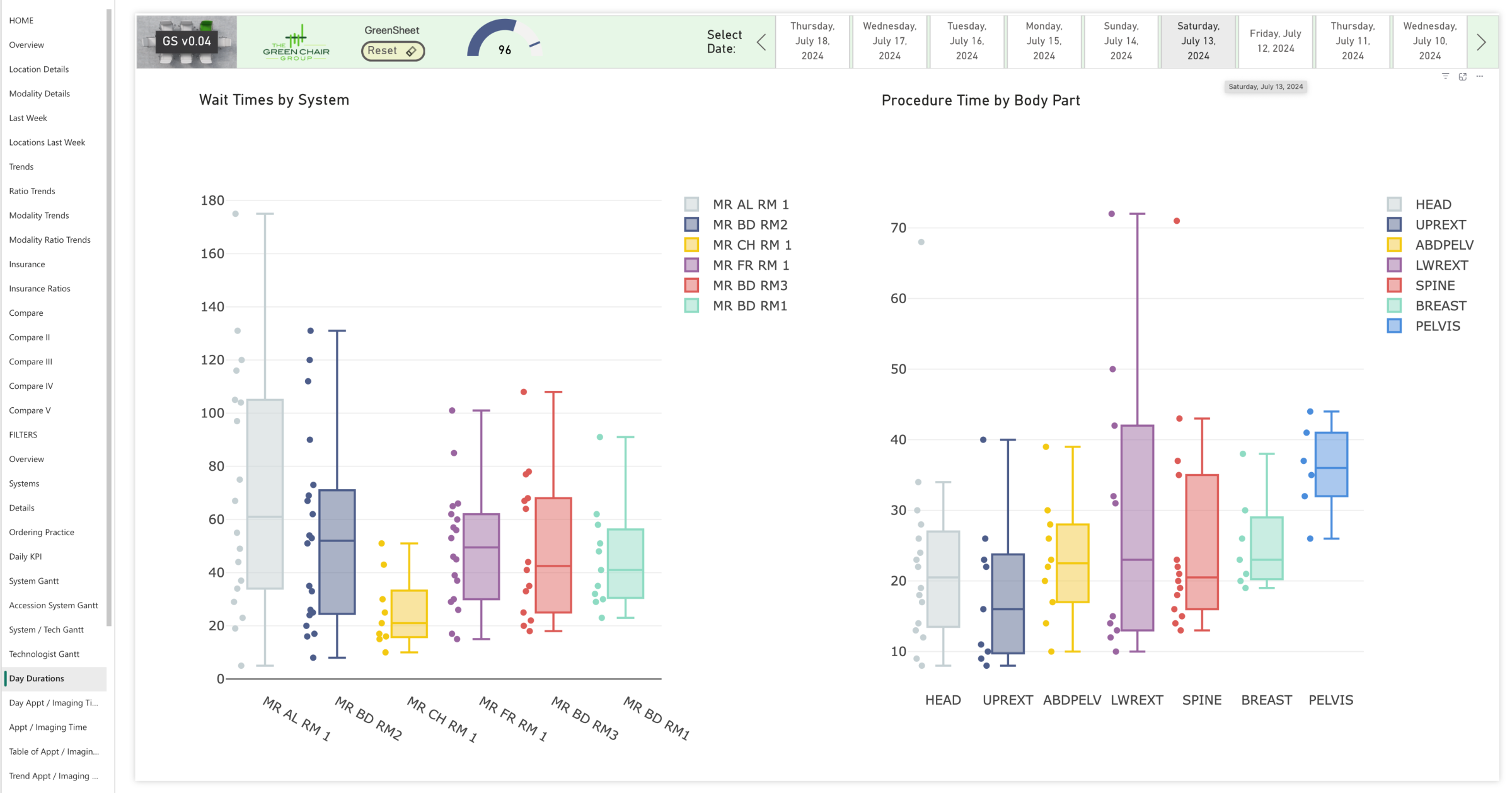
This figure illustrates an analysis of throughput-related operational details, showing how a streamlined, predictable flow reduces unwanted operational variation. Each bar in the figure represents a scanner, with each dot indicating a patient exam. The left side displays average wait times, while the right shows average scan times by body part. Clusters of dots signify optimized operations, and the distance between dots notes outliers.
The graph breaks down the time distribution for individual exams, highlighting variations in how long the same exam takes—ranging from seven to 72 minutes. Each color represents a different exam and the time it takes to complete, showing the time each one occupies. Such variability suggests inefficiencies or issues causing certain exams to take significantly longer than others.
By pinpointing and understanding specific delays or bottlenecks by analyzing outliers (like the 72-minute exam), the goal is to identify all contributing factors to extended exam times and then address and eliminate these root causes to achieve a more consistent, optimized exam duration.
Measureable Operational Improvements
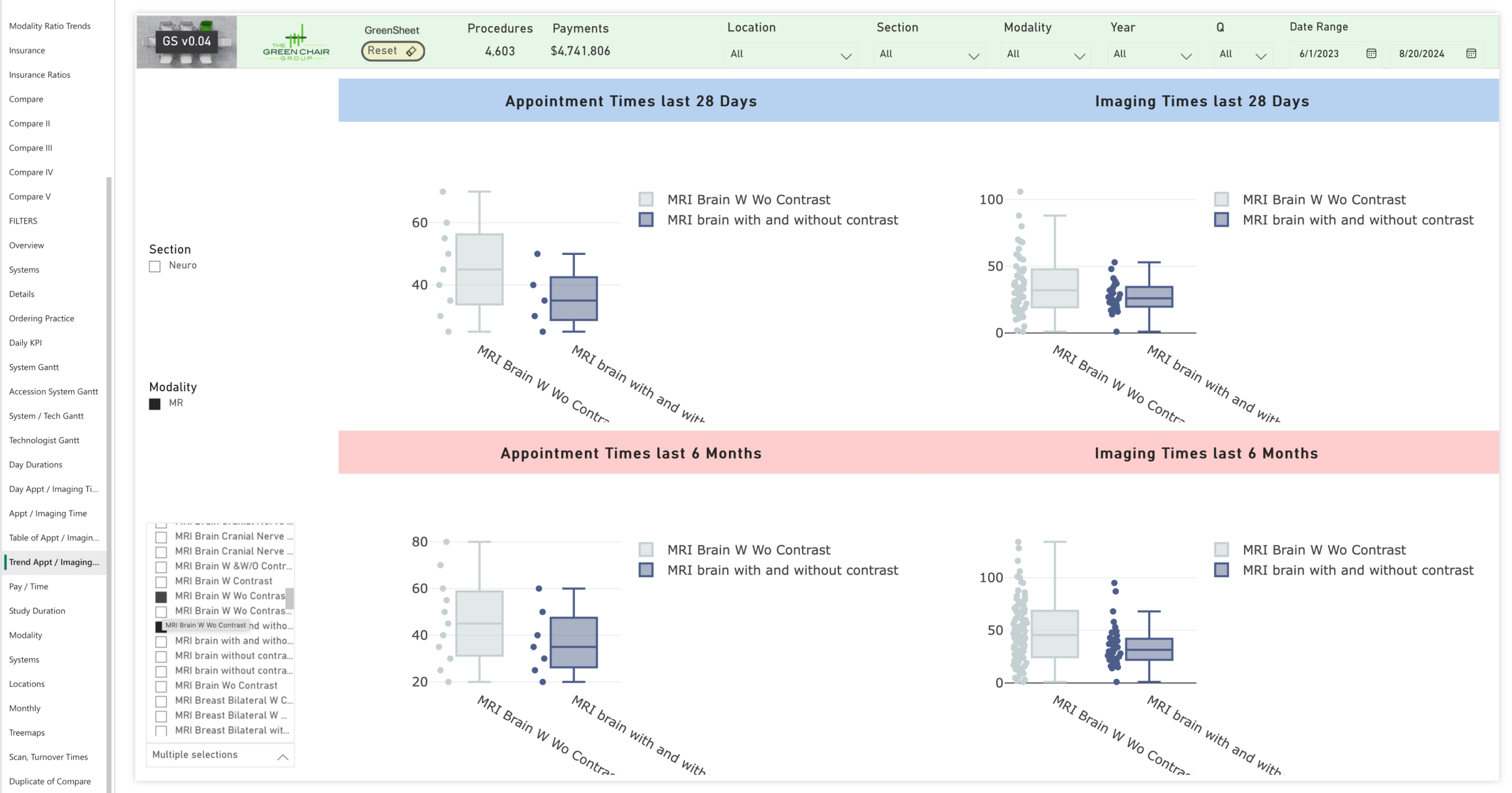
This page of the GreenSheet visualizes operational improvements for brain MRIs with and without contrast over time. On the left side, graphs show scheduled exam durations, where the recent four weeks (top left) have more consistent and shorter scheduling compared to the broader six-month range (bottom left).
Actual exam times are displayed on the right, with each dot representing an exam. The tighter clustering of these dots shows a reduced variation and improved consistency. Eliminating unnecessarily long scheduled exams decreased the exam range from 80 to 70 minutes (-12.5%) over 28 days.
Comparing the bottom to the top and aligning scheduled versus actual times demonstrates clear improvements in exam efficiency. More efficient scheduling contributes to significant patient satisfaction and revenue growth.
Getting Operations in Sync
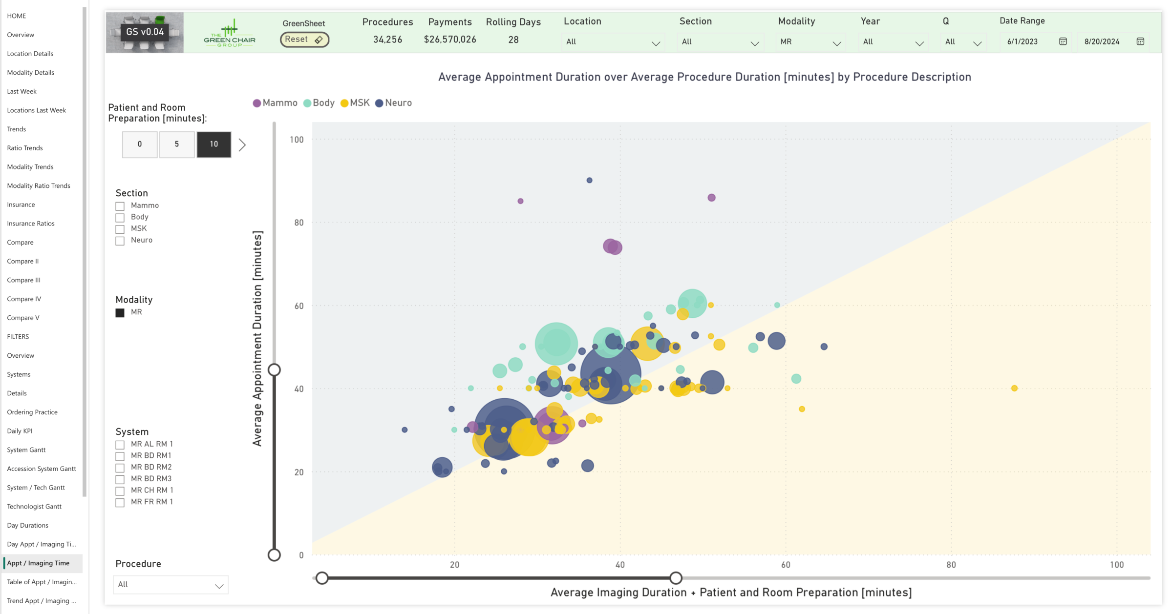
The GreenSheet compares scheduled versus actual MRI exam times. Each bubble represents a specific MRI procedure (e.g., Brain MRI with and without contrast), with bubble size indicating procedure count. Ten minutes are included to account for patient handling and positioning. Ideally, all bubbles align along a line where the scheduled time matches the actual exam duration (plus patient handling time).
Bubbles in the gray area represent exams with overly long scheduled times, creating idle time that could be reduced. Bubbles in the yellow area suggest a need to increase the planned time to match the actual exam duration.
Using the GreenSheet combined with post-analysis operational improvements, workflows can be fine-tuned by adjusting schedules to align more closely with actual times, improving throughput and utilization. Customized filters allow users to drill down into specific operations and identify targeted improvements, ensuring scheduling accuracy across procedures.
Scanning Faster Might Be Neccessary but Is NOT Sufficient
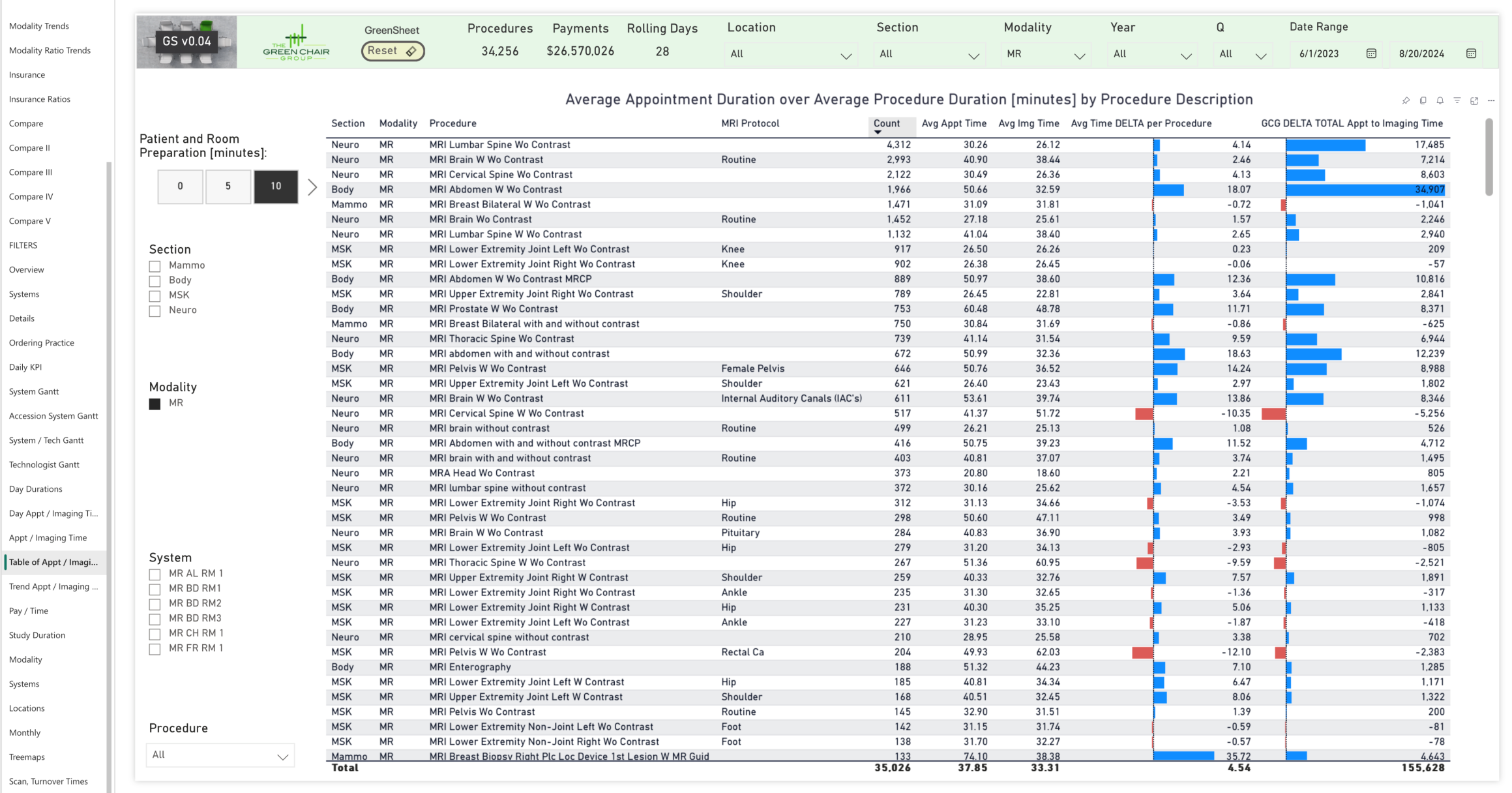
This figure shows an example and provides a detailed list of all MRI procedures and protocols, comparing scheduled times to actual scan and handling times. This comparison pinpoints misalignments, highlighting areas with significant scheduling discrepancies and opportunities for improvement.
The table illustrates that all operational aspects of a department need to be aligned to enable additional patient volume.
For example, the longest blue bar at the top of the graph shows 580 hours (34,907 minutes) of unused scheduled time for one MRI procedure, indicating areas of inefficiency and revealing specific procedures where adjustments are needed.
The Financial View
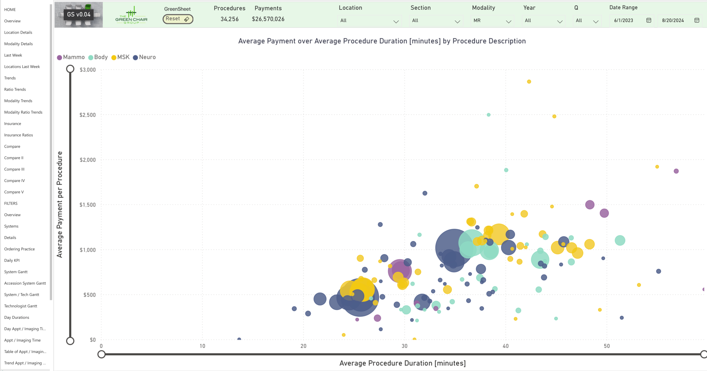
The GreenSheet compares procedure time with average reimbursement per procedure, with bubble size indicating procedure count. The chart illustrates the relationship between exam times and reimbursement.
While clinical outcomes inherently determine the requisite duration for each examination, analyzing how time is allocated enables informed and deliberate decision-making. Operations should be optimized for better financial returns. The analysis supports data-driven decisions to improve patient care while at the same time improving the ROI by moving beyond big-picture insights into specific, actionable improvements.

